Poteten 0 Posted November 9, 2013 okey, i tested sometinh new. imo it went alright, but idunno the tut was abit wierd. and the font on both might be abit bad lmao. anygay, please rate it and comment what u think i will post 2 versions. if u gonna hate and be a bitch, comment why Share this post Link to post Share on other sites
Kim 10 Posted November 9, 2013 I'll be a bitch this time bro kakakka I know you had a hard time to do this, but i actually didn't liked the final result. =\ Maybe too much different effects, maybe 2 different fonts, maybe the incomplete bow, maybe the "Eminence" font out of the frame... i dunno Do you still have the project saved? Can you post the signature without any text? Anyway, i liked the second one better. kakakka Share this post Link to post Share on other sites
Poteten 0 Posted November 9, 2013 I'll be a bitch this time bro kakakka I know you had a hard time to do this, but i actually didn't liked the final result. =\ Maybe too much different effects, maybe 2 different fonts, maybe the incomplete bow, maybe the "Eminence" font out of the frame... i dunno Do you still have the project saved? Can you post the signature without any text? Anyway, i liked the second one better. kakakka yeah lawl, ill take that no prob <3 bitch uehueh it might was abit to much effects indeed. followed a tut, got messy. yeah lemme post soon. but thanks <3 Share this post Link to post Share on other sites
Kim 10 Posted November 9, 2013 hmmm? It looks better, try to use just the tag and your nick, with the second sign font, and place it on the left top corner. I think it will look cool. Share this post Link to post Share on other sites
Kim 10 Posted November 9, 2013 naow? Getting cooler kakakak Share this post Link to post Share on other sites
Poteten 0 Posted November 9, 2013 other twist, not so sure yet tho... Share this post Link to post Share on other sites
~Mark! 1 Posted November 9, 2013 U have the same thing as me with texting; can't find a matching render. Anyway, I like this one Stian, goodjob Share this post Link to post Share on other sites
Poteten 0 Posted November 9, 2013 U have the same thing as me with texting; can't find a matching render. Anyway, I like this one Stian, goodjob fucking hate typographie work.... uehuheue thanks breh Share this post Link to post Share on other sites
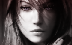
Teapot 1 Posted November 9, 2013 Youre smudging too much over the render (look at the archer's face, it looks like she has a moustache) I like the idea of the lightning over the bow, but the bow is cut off (((( Share this post Link to post Share on other sites
~Mark! 1 Posted November 9, 2013 Oh lol, I meant font, lol. Share this post Link to post Share on other sites
Poteten 0 Posted November 10, 2013 Youre smudging too much over the render (look at the archer's face, it looks like she has a moustache) I like the idea of the lightning over the bow, but the bow is cut off (((( hmm yeah, i followed a tutorial, abit wierd one. and its the first time doing this kind of "effect" so ur right! yeah, i noticed that myself why the fuck dident i have the whole bow euheuhuehe. anyway, thanks <3 Share this post Link to post Share on other sites
Kim 10 Posted November 10, 2013 Thats it! 9/10 Only thing you could do to make it better is remove the effects on the back of ur archer OR just use the effects inside the frame. The effects on the bow looks cool! *-* Share this post Link to post Share on other sites
Poteten 0 Posted November 10, 2013 Thats it! 9/10 Only thing you could do to make it better is remove the effects on the back of ur archer OR just use the effects inside the frame. The effects on the bow looks cool! *-* sweet, thanks for the help breh <3 yeah well, atm fuck it! to lazy ueheuhuehe. @ rest thanks for the feedback too:) Share this post Link to post Share on other sites
Kim 10 Posted November 10, 2013 Youre smudging too much over the render (look at the archer's face, it looks like she has a moustache) I like the idea of the lightning over the bow, but the bow is cut off (((( LOL i didn't noticed the hitler mustache till u pointed it out! kakakakkaka Share this post Link to post Share on other sites
Poteten 0 Posted November 10, 2013 Youre smudging too much over the render (look at the archer's face, it looks like she has a moustache) I like the idea of the lightning over the bow, but the bow is cut off (((( LOL i didn't noticed the hitler mustache till u pointed it out! kakakakkaka euhuehe i died. Share this post Link to post Share on other sites
Gaara 0 Posted November 16, 2013 NICE Sign bro very nice :-* Share this post Link to post Share on other sites
Poteten 0 Posted November 16, 2013 nais Thanks Narb! Share this post Link to post Share on other sites
Ciroc 0 Posted November 16, 2013 hey biatch u know me and ill give my opinion until u make all the way to a great sign. I would put the nick + clan tag on the left bottom corner, since the archer is on the right, it's strange to put it where it is. wouldn't use a bigger nick behind it, cause it's kinda strange. the effect of these thunders on the archer and on the bow it seems strange, can you make other thunder effects? i think that this thunder effect is good enough on the bow, unecessary to put this effect on the archer these black dots on the sign i didn't like it the background i didn't like it as well... Share this post Link to post Share on other sites
Poteten 0 Posted November 16, 2013 hey biatch u know me and ill give my opinion until u make all the way to a great sign. I would put the nick + clan tag on the left bottom corner, since the archer is on the right, it's strange to put it where it is. wouldn't use a bigger nick behind it, cause it's kinda strange. the effect of these thunders on the archer and on the bow it seems strange, can you make other thunder effects? i think that this thunder effect is good enough on the bow, unecessary to put this effect on the archer these black dots on the sign i didn't like it the background i didn't like it as well... yeah i know, and i like that u do it thanks for the good part uehueh and the effect on archer are new, never done that thing before. followed a tutorial... but yeah, i will make a new and improved later <3 Share this post Link to post Share on other sites
 Crimson Plunder (Patch 5398) Started
Minions (Patch 5363+) Started
Hellfire Catacombs (Patch 5349+) Started
Crimson Plunder (Patch 5398) Started
Minions (Patch 5363+) Started
Hellfire Catacombs (Patch 5349+) Started